IntoHerWaves
SERVICES
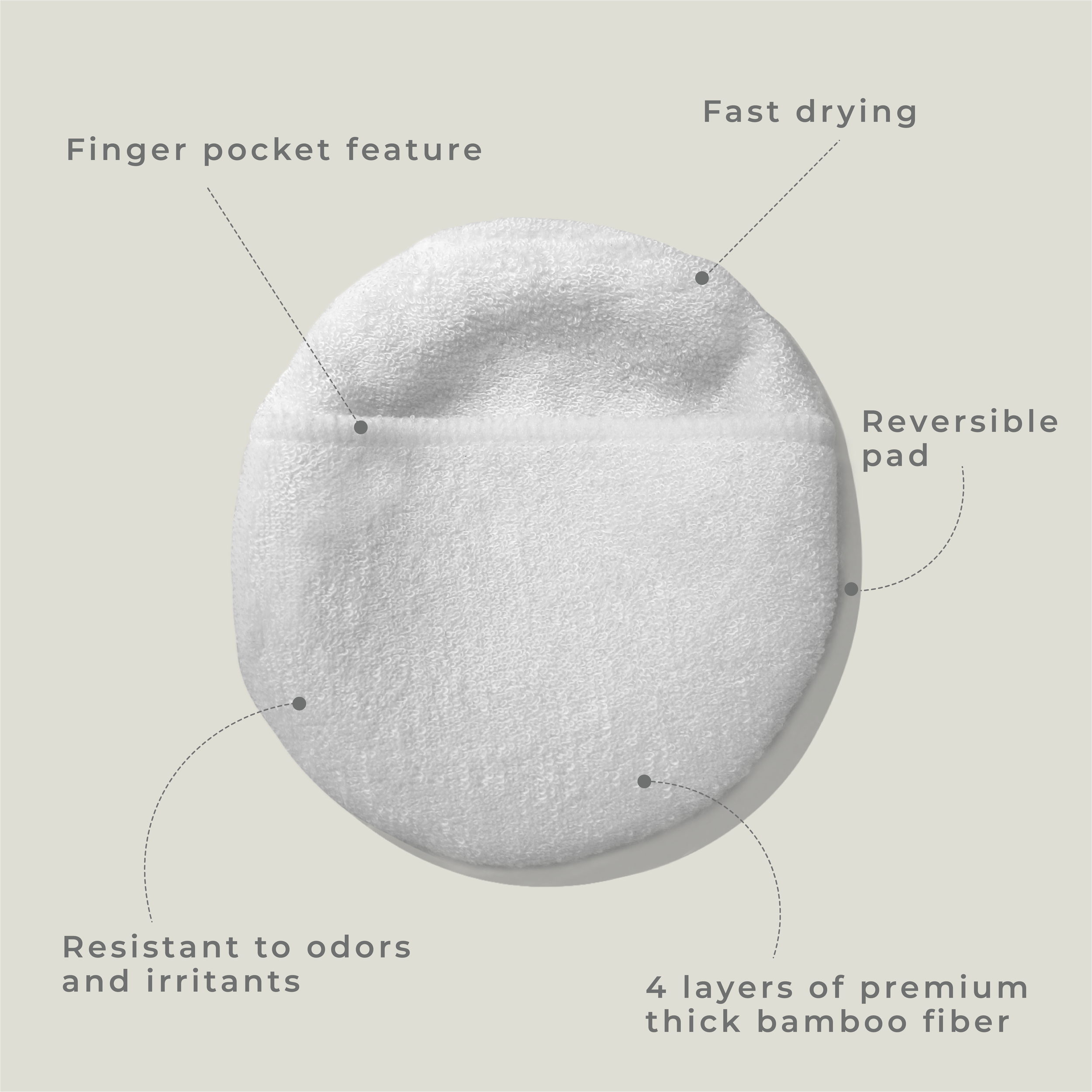
Branding / Packaging / Visual IdentityThe ocean is our playground, and it's up to us to keep it clean and thriving and with those sentiments, intoherwaves was born. Sunscreen is an essential part of our surfing routine. It protects our skin from harmful UV rays and prevents sunburns. However, one common issue that many people face when using sunscreen is the dreaded white cast. This white residue can make our skin appear pale and ghostly, which is not the look we're going for.
In the world of branding and design, the visual identity of a brand plays a crucial role in conveying its values and personality. For Into Her Waves, a brand dedicated to promoting sustainability in the world of surfing, a minimalist aesthetic was the perfect choice to reflect their commitment to simplicity and environmental consciousness.
The logo of Into Her Waves is a key element in their visual identity, capturing the essence of the brand and its connection to the ocean. The colour palette chosen is carefully curated to evoke a sense of softness and warmth, while also symbolising the sun and its connection to the surfing experience. The brand primarily uses neutral colours, such as shades of white, gray, and beige, which provide a clean and timeless backdrop for their visual identity. The use of tangerine as an accent color not only adds visual interest but also symbolises the warmth and joy that comes with being out in the sun, riding the waves.